Create animated charts for data visualization using R
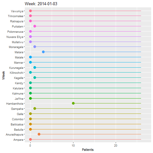
Many traditional methods of data visualization are now being replaced by new methods. Other than showing several graphs or a stacked graph to present the variation of your data, it would be much more understandable and interesting if you could visualize it as an animated diagram. Here, I have created a lollipop chart animation. In this example I am using the weekly number of leishmaniasis patients in each district of Sri Lanka from Jan 2014 – Dec 2015.
Loading packages (pacman install and load all the packages)
ggplot2 – for charts; gganimate – to animate the charts; rio – to import data; dplyr & tidyr – to arrange and tidy the data; gifski – To render the animation
pacman::p_load(ggplot2, gganimate, rio, tidyr, dplyr, gifski)

#pacman (package manager install and load all the packages.)
Importing data and checking
clTemp <- import("C:/Users/hp/Documents/MEGAsync/TWData/cltdata.csv")
cltraw <- clTemp[1:103] # selecting the exact range of data from the imported data sheets.

head(cltraw)[1:4] # Checking first four columns of the data frame
##       District 3/1/2014 10/1/2014 17/01/2014
## 1      Colombo        0         0          0
## 2      Gampaha        1         0          0
## 3     Kalutara        0         0          0
## 4        Kandy        0         0          0
## 5       Matale        0         0          0
## 6 Nuwara Eliya        0         0          0
In the data frame, a week is a column. But we need to get all the weeks as a row of a new column called week. This is done by pivot_longer function (gather() is another possible function for this. But that has been stopped developing and may not be available in coming versions. So I am using pivot function)
Lets pivot
cltpiv <- pivot_longer(cltraw, cols = 2:103)


cltpiv %>% tail(10)
## # A tibble: 10 x 3
##    District name       value
##    <chr>    <chr>      <int>
##  1 Kalmune  23/10/2015    NA
##  2 Kalmune  30/10/2015    NA
##  3 Kalmune  6/11/2015     NA
##  4 Kalmune  13/11/2015    NA
##  5 Kalmune  20/11/2015    NA
##  6 Kalmune  27/11/2015    NA
##  7 Kalmune  4/12/2015     NA
##  8 Kalmune  11/12/2015    NA
##  9 Kalmune  18/12/2015    NA
## 10 Kalmune  25/12/2015    NA
I’ve included data for all 26 districts. So for 26*102 should be the num of rows
nrow(cltpiv)
## [1] 2652
Pivoting converts the variable into characters. So I will create a Week clumn separately and cbind it to the data frame.
startDate <- as.Date("2014-01-03")

Weekraw <- seq(startDate, by="1 week", length.out=102)

Week <- rep(Weekraw, times = 26) # coz in the long format need one repitition for each district

tail(Week) # To check if the data is fitting
## [1] "2015-11-06" "2015-11-13" "2015-11-20" "2015-11-27" "2015-12-04"
## [6] "2015-12-11"
Lets combine Week to “cltar”
clt_bound <- cbind(cltpiv, Week)

cltar <- clt_bound %>% select(-name) #remove unnecessary column
In this data set missing values means the number of patients = 0
Lets convert all the “na” s to 0
cltar[is.na(cltar)] <- 0

head(cltar)
##   District value       Week
## 1  Colombo     0 2014-01-03
## 2  Colombo     0 2014-01-10
## 3  Colombo     0 2014-01-17
## 4  Colombo     0 2014-01-24
## 5  Colombo     0 2014-01-31
## 6  Colombo     0 2014-02-07
clt <- cltar # for the ease of calling

colnames(clt) <- c("District", "Patients", "Week") # Renaming columns
Creating the basic plot
p <- ggplot(clt,
       aes(x=District, y=Patients, label = District, color = District)) +
  geom_point(stat = "identity", size = 4) +
  geom_segment(aes(
    y = 26,
    x = District,
    yend = Patients,
    xend = District)
    )
Shifting axis and adding text to bars
p <- ggplot(clt,
       aes(x=District, y=Patients, label = District, color = District)) +
  geom_point(stat = "identity", size = 4) +
  geom_segment(aes(
    y = 26,
    x = District,
    yend = Patients,
    xend = District)
    ) +
  geom_text(color = "block", size = 4) + #adding text to bar
  coord_flip() # shifting axis
Making the animation
p <- ggplot(clt,
       aes(x=District, y=Patients, label = District, color = District)) +
  geom_point(stat = "identity", size = 4) +
  geom_segment(aes(
    y = 26,
    x = District,
    yend = Patients,
    xend = District)
    ) +
  geom_text(color = "block", size = 4) + #adding text to bar
  coord_flip() + # shifting axis
  theme(legend.position = "none") + #removing legend
    labs (title = "Week: {frame_time}", x= "Week", y = "Patients") + # The animation codes starts here
    transition_time(Week)
  ease_aes('linear')
## <ggproto object: Class EaseAes, gg>
##     aes_names:
##     aesthetics:
##     default: linear
##     get_ease: function
##     super:  <ggproto object: Class EaseAes, gg>
Following code renders the animation and give the specifications to animation. You can change duration and the size of the animation by changing the “animate” function. Note that you could use anim_save(“output.gif”) to save the animation as a GIF file. I have removed it as it brings an error when knitting the markdown file.
animate(p, duration = 40, fps = 20, width = 500, height = 500, renderer = gifski_renderer())

# anim_save("output.gif")